by Margaret Atwood
Nan A. Talese
Buy at Powell’s »March 29, 2010
Colum McCann
Barbara Kingsolver
Judged by
Consider the book as an object, as a vessel for the novel. Readers are warned against judging books by their appearances before they’ve read the novels within, but designers, publishing companies, and bookstores conspire against us. They use what economists refer to as signalling to compel people to buy (but not necessarily read) books. The physical size and shape, the page thickness, the fonts and colors used, the choice of title, the back- and front-cover blurbs, the embossed book award and/or Oprah stickers, and the cover—especially the cover—are all signals to the potential buyer that (a) this book is worth her time and money, and more importantly, (b) make her feel a certain way about herself: intelligent, hip, involved, safe. When you see a book, you can’t not have an immediate reaction to it. Your brain does so without consent.
How can you say that one novel is better than another when the packaging exerts so much influence? Perhaps by acknowledging and exploring the particular persuasive forces at work, a more accurate evaluation of the creative work is possible. Let’s make an attempt.
The copy of Let the Great World Spin sent to me was a paperback, physically smaller than the sturdy The Lacuna hardcover. The pages are thin, the type size small, and the price low…not necessarily great signals for the publisher to send my way. The title I can never remember, even having read the book: probably not a good sign. The cover is nice but not particularly eye-catching, a rerun of the hardcover edition’s cover. A few changes to the cover were introduced for the benefit of the book-browsing public: a red “NATIONAL BESTSELLER” banner running across the top, a “NATIONAL BOOK AWARD WINNER” sticker embossed on the front cover, and a smaller “RANDOM HOUSE READER’S CHOICE” badge positioned above a breathless blurb from the New York Times Book Review. The additions must have irked the cover designer, but they attest to the book’s quality and popularity.
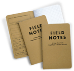
 Keep your lists of books, quotes, and sketches in Field Notes Memo Books. Check our exclusive offer for ToB readers.
The Lacuna is contained within an altogether better vessel. The font is large, the line spacing luxurious, and the pages are nice and thick. The dust jacket is a vibrant yellow and has a small hole cut into the center that shows a bit of the bright turquoise hardcover underneath. Very distinctive. A copy even caught my eye in the window of my local bookshop as I sped past in the swirling snow. The title is short and memorable; I had no trouble recalling it when speaking to a friend about the book. But the key signal to the potential buyer is the “deckle edge” of the book’s pages. A deckle edge is the rough edge of a piece of paper that makes it look handmade. A book with deckle-edge pages clearly indicates to the buyer that the publisher thinks this book is SRS BSNS, an important and lovingly crafted object worth the $27 list price. No book with a deckle edge could possibly be a waste of time.
Of course I read The Lacuna first. And I ended up liking it more than McCann’s effort, hopefully not because of the colorful cover. Not that it wasn’t close. Both authors chose to weave their stories around real-world events (post-WWII communism in The Lacuna and Philippe Petit’s walk between the Twin Towers in Let the Great World Spin) but The Lacuna’s simpler story appealed to me a bit more than Spin’s more ambitious multi-threaded tale, even though McCann nailed the feeling of New York City in the mid-’70s, at least from my only-read-about-it-in-history-books perspective. The thing that sticks with me the most about Kingsolver’s book is the heartbreaking illustration of a quiet yet talented and passionate man just trying to live a life while the world’s powerful forces whirl around him, first pulling him up and then almost smothering him into the ground. It’s a sobering reminder that only certain types of individualism are celebrated in America.
Jason Kottke blogs at kottke.org. He lives in New York City. Known connections to this year’s contenders: “Zero conflicts.”