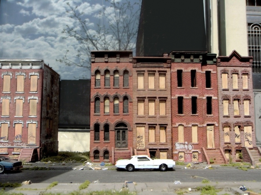
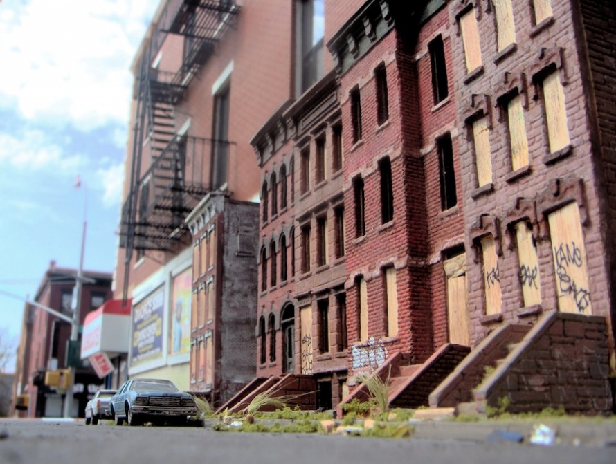
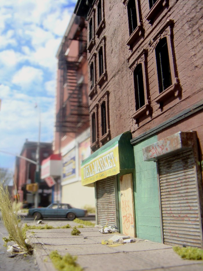
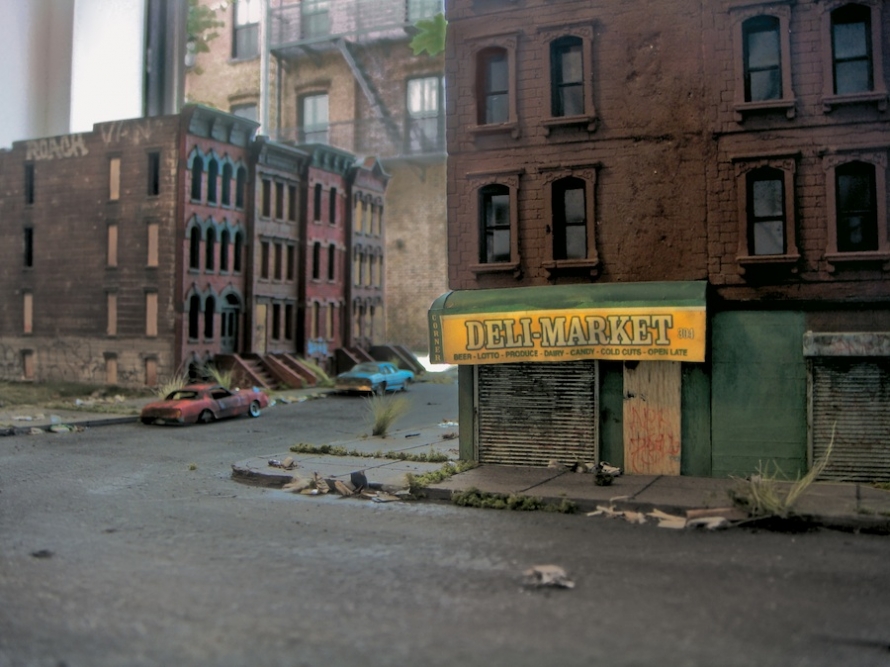
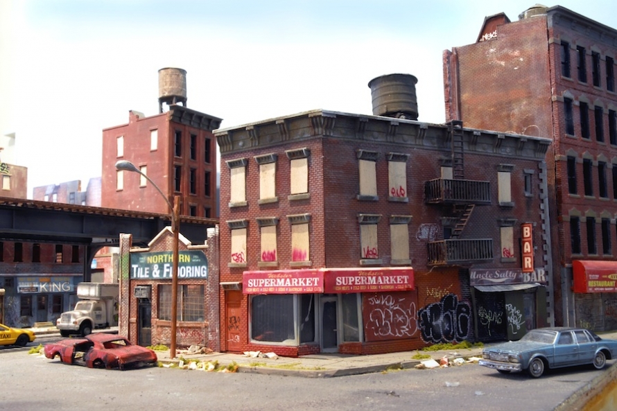
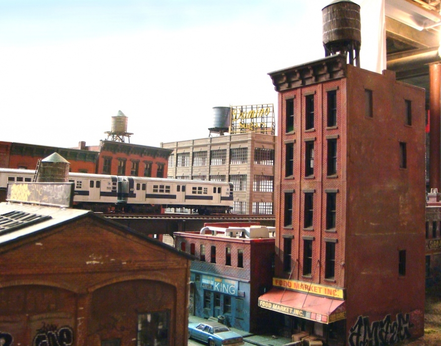
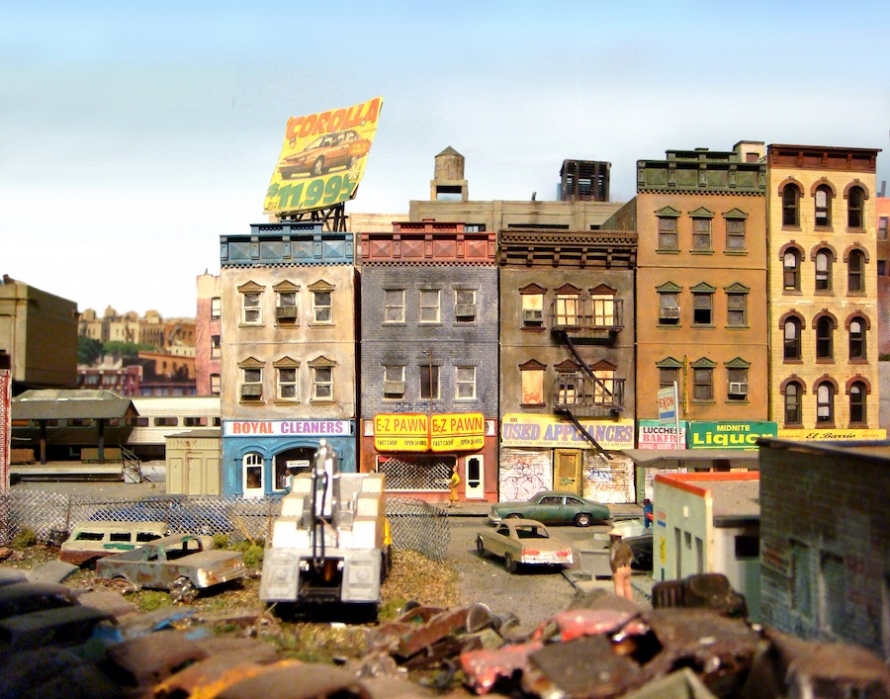
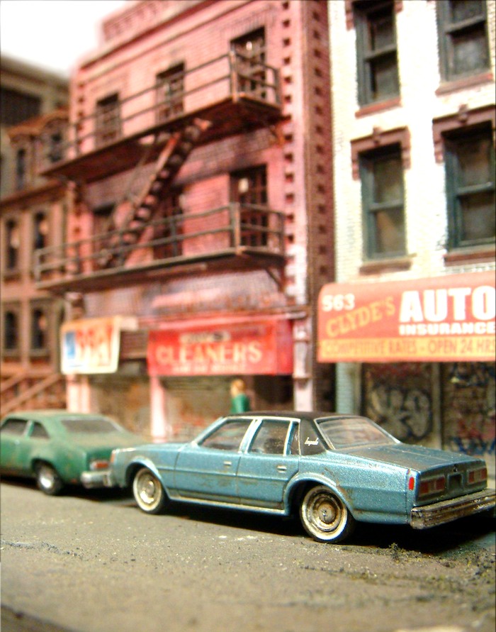
Boarded-up windows in abandoned brick buildings, grass growing from sidewalk cracks, rusty storefronts—the cycle of a city’s evolution and abandonment is familiar. Artist Peter Feigenbaum reimagines these ghettos in miniature, using components from toy train sets and more. “‘Trainset Ghetto’ is voyeurism more than it is hobbyism. It is the physical byproduct of teenage suburban daydreams and attempts to live vicariously through an alien post-urban 1980s landscape that was in no way part of my quotidian existence.”
Peter Feigenbaum is a Brooklyn-based installation artist and musician. He has shown work related to his “Trainset Ghetto” installation at a number of small New York galleries since 2007. He studied architecture at Yale University. “Trainset Ghetto: Streetsmart” will be on display at Open Source Gallery, Sept. 4-30, 2010. All images © the artist, all rights reserved.
When did you start this project? What materials did you use? Was it hard to make these idealized train sets into something a little grungier?
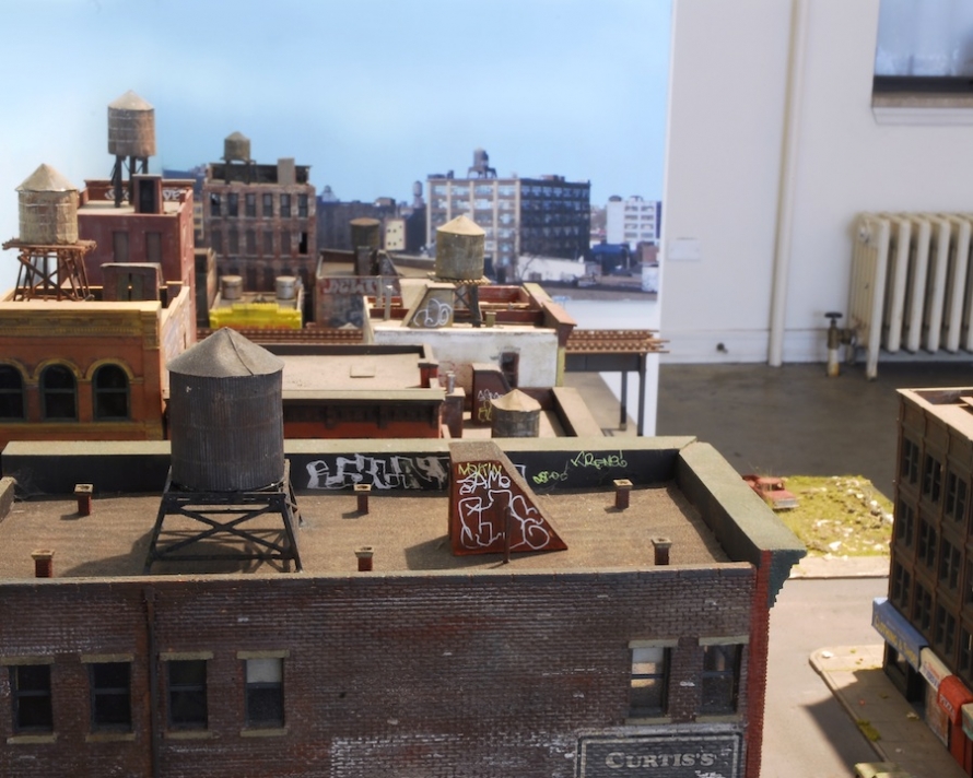
I started the project in 2004. Materials include cast plaster, polystyrene plastic, chipboard, basswood, green foam, tempera. I have my ways to achieve the grungy look. Sometimes I’ll pick up chunks of asbestos (just kidding) or rubble out of a dirty basement and sift the bits, then dump them onto the project. I use a lot of dry-brushed tempera for a super flat texture on many of the buildings. I dabbled in graffiti as a kid, so I brought my knowledge of throw-ups and tags into play as well. Chalk dust helps, too. Making stuff dirty and off-kilter is pretty intuitive, I think.
Describe the photo shoot. Where does this set exist now?
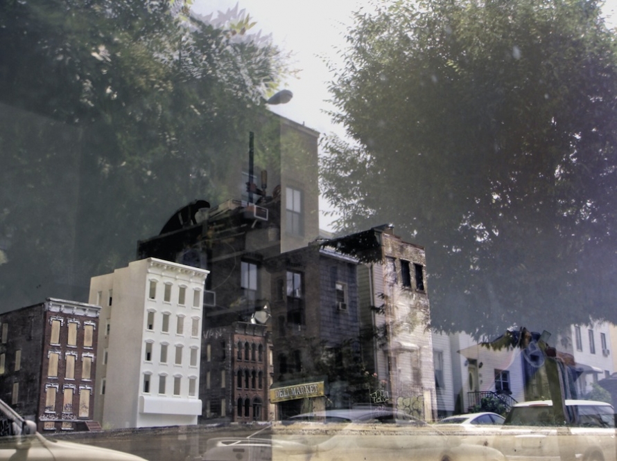
This was the first shoot I did on an actual N.Y.C. street. People generally ignored it or stayed out my hair, which was nice. Even though the installation is very familiar to me, every shoot will have different angles that seem to work best, so I always tend to experiment for an hour before really diving in with rigor. It also took some experimentation to get angles in which the full-size landscape blended “perspectively” with the installation, especially when I started to use the reflective window on the gallery storefront.
Why did you pick ’80s-era ghettos?
Can’t explain why I like what I like. But I guess I have this fascination with urban wildness—it’s a way for me to objectify an urban experience that’s quite different from my current scenario. Nostalgia for an era that I never experienced? I was also inspired by a lot of location-heavy graffiti and crime films from the late 1970s/early ’80s as well. I also have a dark sense of humor!
Would you call yourself a sculptor or a photographer?
Neither! I make 2D hyper-reality using found/altered objects. I’m not documenting something that exists in real life, that’s for sure, and I’m not pursing in 3D “formal” explorations either. I think there’s always been some awkwardness in previous shows I’ve had as to whether I should be presenting the project as a 3D installation or as a series of photographs. I’ve come to the conclusion that showing the photographs and the installation together in the same room is actually unwise as the two have a canceling effect—the installation almost becomes a punch line to the series of photographs. So I’m excited that this show will leave the actual models out of the equation, creating more of a mystery. I think my work probably falls into the genre of scene creators like Gregory Crewdson, James Casebere, David Levinthal, or even Tom Sachs.
How does this project exist in tandem with the world of architecture in which you work?
There’s very little overlap other than the model-making techniques I have accumulated over the years. Architecture is still primarily about programmatic usability—large-scale ergonomics—whereas my work is about memory and experience. But even architectural model-making is very different from my work. There is less emphasis on texture, detail, materials, and photorealism, and more on concept and diagramming. My project probably has more in common with film/TV sets.
Your inner-city mini-neighborhood is beautiful, but there are plenty of city planners who would like them to disappear. What would your ideal neighborhood look like?
I really am into cities with spectacular topography lately and a Mediterranean vibe. I’ve been into Google Street View-ing coastal hill cities along the Amalfi coast in Italy. I still have a fetish for Corbusian Brutalism—I really liked the decaying/futuristic housing projects in Scampia near Naples that figured prominently in Matteo Garrone’s film Gomorrah.
Generally, any city that has a strong vernacular style that is repeated infinitely has always appealed to me. I think future projects might involve something related to the bastardization of Le Corbusier’s Voisin plan into the ubiquitous cruciform public housing projects that one sees all over New York, or maybe try to build a model of Compton, Calif., since I’ve been really into the paradox of sunny palms, ranch houses, and casual violence expressed in early ’90s gangster rap.
What are you working on now?
Probably going to work on some more narrative shots with my buddy Michael Reynolds, who did some music videos for Titus Andronicus and the Walkmen. We are going to use figurines to illustrate morbid scenarios—something I was previously opposed to, but am now interested in. Mostly working on music now with Dinowalrus, attempting to launch a massive Madchester revival in 2011!
