The color that has come to signify America in today’s combat theaters isn’t the red, the white, or the blue picked by Betsy Ross, but an ignoble sandy hue commonly referred to as desert tan and officially identified as Federal Standard 595 Color No. 33446 .
The color came of age in December of 1990, when, according to military lore, Gen. Norman Schwarzkopf, then stationed in Saudi Arabia as commander-in-chief of the US Central Command, got a new pair of shoes: prototype combat boots, size 11.5R, which he unboxed, examined, and hurled at the soldier who delivered them.
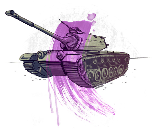
Like almost every other piece of gear amassed by the US military at the start of the Gulf War, those boots weren’t made with the Middle East in mind. Photographs of the conflict—ones taken between August 1990 and January 1991—show transport vehicles, trucks, tanks, tents, and soldiers covered in Vietnam-era olive drab and a three-color woodland camouflage that sticks out from the desert like a pickle on hummus. Schwarzkopf wasn’t having it. Shortly after throwing that pair of shoes, he ordered stateside manufacturers to develop all-cotton desert camouflage combat uniforms and paint all vehicles bound for the Persian Gulf desert tan. For vehicles on the ground, he established spraying facilities to repaint them on site.
By the end of the conflict, the lion’s share of the 697,000 US troops who had served on active duty in the Gulf were wearing camouflage patterned with desert tan, driving in desert tan, sleeping under desert tan, and handling tools painted desert tan. Now, two decades later, with nearly 100,000 troops in Afghanistan, 50,000 in Iraq, 10,000 in Kuwait, and almost two million returned within the past nine years, that tan, Federal Standard 595 Color No. 33446 , is one of the dominant colors of America’s armed forces, an enduring symbol of our age, and another swatch in the strange chromatic history that the US has painted in plain sight across the country and around the world.
The Colors of Bureaucracy
The official swatch of desert tan is housed in Franconia, Va., just outside Washington’s beltway, in a warehouse filled with the rest of the federal government’s certified color chips. From there, for $625, you can purchase a complete set of the 650 three-by-five-inch cards that define the colors covering the vast majority of items purchased by the Federal Acquisition Service, a $50 billion subsection of the General Services Administration, which acts as a kind of equipment manager for federal agencies around the country.
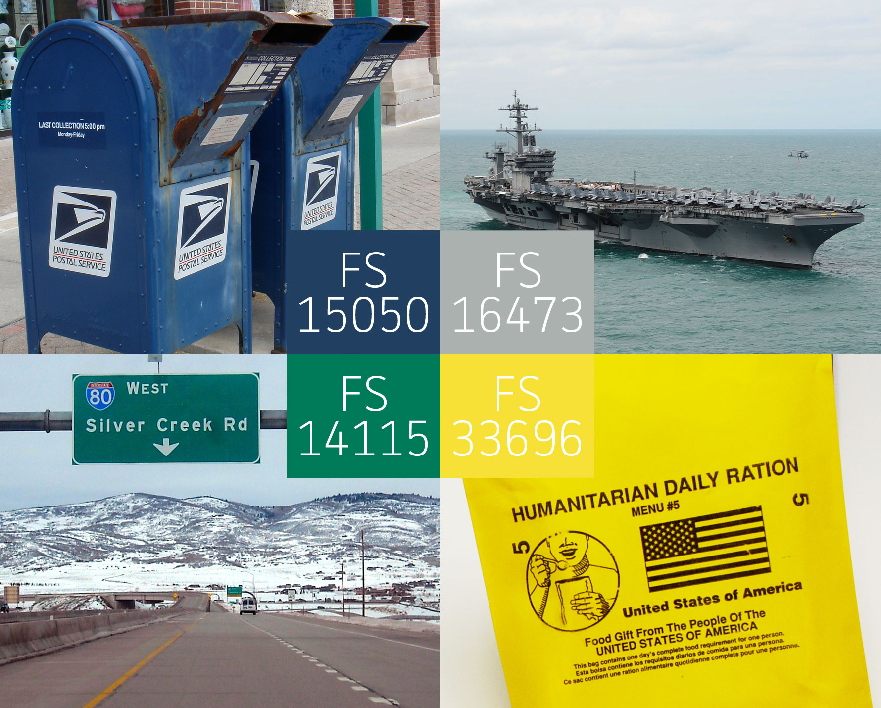
If the IRS needs new computers, or the National Park Service wants new trucks, or the Navy needs to repaint an aircraft carrier, the Federal Acquisition Service finds the best deal on Dells or Dodges or hundreds of thousands of gallons of FS No. 16473 gray paint. They don’t pick the products or the colors—that’s up to the requesting agency—but oversee their acquisition, consistency, delivery, and cost.
If you’ve ever worked in an office and tried to get yellow legal pads or red pens or 2.0 mm lead for your German-made mechanical pencil, you can imagine how bizarrely complicated this gets: “College-ruled or wide?” “Fine point or medium?” “It’s Bic or bust, bub!” Add to that the volume of requests, the size, significance, and specialization of the orders and the triple-rush timelines imposed by hostage crises, natural disasters, and war, and Ronald Reagan’s infamous assurance: “We didn’t buy any $600 toilet seat. We bought a $600 molded plastic cover for the entire toilet system,” starts to shift from the realm of satire to the strangely possible. One of the many tools that the US government has developed to systematize this ungainly process and foster transparency is the official color palette known as Federal Standard 595. It narrows the available options to a manageable selection, and in the rare circumstances that the established hues don’t suffice, creates a detailed protocol for temporary change notices, as well as full-scale revisions.
Vietnam-era olive drab and a three-color woodland camouflage stuck out from the desert like a pickle on hummus.
“FS 595 has become an effective and easy way for agencies to get the colors they want,” Randall Schober, who heads up the paint management team at the Federal Acquisition Service’s Heartland Global Supply center in Kansas City, told me during a phone conversation monitored by his supervisor and a press officer. “They provide us with a physical color chip that we use to define, reproduce, and then distribute the color to interested parties,” he recited.
When I asked him if he had a favorite color, he took a considered pause and said, “No.”
When I asked him if—as a color expert who oversees so much of what Americans look at each day—there isn’t one shade that stands out to him, even just a little bit, he sternly replied that greens were the most popular in the federal palette, but from his personal perspective, “It’s hard to see the forest from the trees.” I laughed, but no one else on the call made a noise.
Pinning Down Pig Slop
“Federal Standard 595—Colors Used in Government Procurement” has its roots in World War I, when in 1918 Bulletin No. 90 of the General HQ of the American Expeditionary Force established a color identified as “olive drab” as the official shade for tactical vehicles, though what exactly those words indicated was a subject of some confusion. In 1917, the manual for the Quartermaster Corps had defined olive drab as a combination of ochre and black pigments, though it did not mention a specific ratio, nor did it indicate which manufacturer’s pigments were best suited for the job.
Charles Lemons, a curator at the Patton Museum of Cavalry and Armor in Fort Knox, Ky., once described that era’s olive drab to the military historian Steven Zaloga as, “pig slop, a very muddy brown,” and though that certainly meant something specific to him, and something quite close to people who are familiar with pig slop, imprecise explanations like that can’t get thousands of factories producing and painting tactical vehicles on the same page. Even after the fighting was over, when there were numerous attempts to pin down the exact qualities of the official olive drab—fixing the degree of gloss, establishing a precise proportion of ochre to black, and forging an agreement between the different branches of the armed services—each effort was soon overturned, outdated, or simply ignored.
The blue of rest stops (F.S. No. 15090), the brown of recreation signage (F.S. No. 10055), and acres of instructional green (F.S. No. 14115) sprang from America’s expressways like ripe military-industrial fruit.
The shifts were partly due to specific needs—the Air Force, for example, found that a darker shade of olive drab looked better in flight than the one preferred by the Army—and partly due to advancements in chemistry: faster-drying enamels generated colors with a different profile. Military pride was a factor too: the matte, lusterless olive drab that excelled in muddy trenches scuffed easily and looked dingy in the bright lights and parades of peacetime. By the middle of World War II, the military’s official color for tactical vehicles had been at least six different versions of olive drab. Multiply that variety by the 600,000 prime contractors enlisted to help with production efforts, the differences in their mixing instructions and the range of their sample colors—if they were fortunate enough to have any at all—and the US had a hodgepodge of equipment whose raggedy appearance undermined the uniformity so prized by military men.
As mismatched supplies appeared in greater numbers, bureaucrats and commanders in search of order introduced a simple solution: On April 21, 1943, the Army Resources and Production Division established 72 standard colors and three basic finishes. But instead of using a small set of base colors to generate a wide array of shades, which is what color systems like Pantone do, the government’s standard colors had nothing between them: no relationships, no mixing, no families, no names. There was only a color chip and a number that signified it. When the military needed something, the requisitioner would specify the color’s number, then send the chip on to the manufacturer with the order. It worked, and it stuck. In March of 1956, the General Services Administration adopted this system as a federal standard, vesting it with the same kind of authority and rigor carried by weights, measures, and even laws.
Civilian Life
The first iteration of the Federal Standard Color Palette contained 358 colors: lots of greens and browns and grays. The majority came directly from the 216 hues (72 colors, each in three glosses) established during the Second World War, plus the blues, yellows, oranges, purples, and reds of various seals and insignias, as well as bold colors used to indicate the contents and direction of the engine-room pipes running beneath everything from military bases to battleship decks. They were paint and finish colors first and foremost, but served as reference for textiles, paper products, and dyes too. As federal agencies flush from the post-war boom began to expand, they were forced to address road signs, mail trucks, office furniture, and all sorts of other governmental trappings that were patchy from decades of inconsistent outsourcing and updating. In these years, the federal palette caught on among domestically focused agencies, and a series of temporary additions known as “change notices” added hues requested by the Postal Service, the National Park Service, and the Dept. of Transportation. In 1968, these change notices were incorporated into the first of three major revisions of FS 595, thenceforth known as FS 595A.
As President Eisenhower’s interstate highway system cut its way across the United States, the blue of rest stops (FS No. 15090 ), the brown of recreation signage (FS No. 10055 ), and acres and acres of instructional green (FS No. 14115 ) sprang from the tree of America’s expressways like perpetually ripe military-industrial fruit.
That orange carries a lesson with it. It warns. It says people are working; shouts that equipment is ahead. At the end of a cap gun, it pledges that nothing more than noise will come out.
In the car-oriented suburban communities that built up alongside these multi-lane ribbons of closely controlled asphalt, big blue mailboxes (FS No. 15050 ) replaced thousands of streetlamp-mounted red-and-blue mail collectors that had marked city corners, town groceries, and meeting spaces for generations. They were suitable for the strip centers and shopping malls that were sprawling outward, too, and quickly came to pimple the nation’s newest public spaces: parking lots.
In 1956, a National Park Service struggling to accommodate a suddenly mobile population with money to burn and time to explore began a 10-year, $1 billion dollar infrastructure overhaul known as Mission 66. Hundreds of miles of parkways were finished, dozens of visitor centers were built, and millions of gallons of Park Service brown (FS No. 30140 ) were brushed, sprayed, and stained onto the kiosks, fences, signs, and visitors’ centers that served as the threshold to America’s wilderness.
In these few short years, America’s newly opening landscapes—residential, rural, and the fastest routes between them—were given a visual identity by the federal government. If olive drab and its ilk were the colors of Tom Brokaw’s Greatest Generation, then the hues of the first revision were those of America’s well-branded internal expansion. Every mailbox, park sign, and highway mile-marker was another tiny flag planted by a growing nation, proclaiming its new success with the same methods and military sensibility that had recently secured it a starring role on the international stage. Though they’re brighter and friendlier, the colors and rules that dictated the look of American infrastructure’s mid-century boom are every bit as ordered as a dispatch from the Quartermaster Corps.
Color to the People
After the 1968 revision, the federal color standard didn’t see another comprehensive modification until 1989. From the beginning of the Nixon years to the end of Reagan’s there were, of course, a series of seismic technological and social shifts that demanded the issuances of change notices. When these were incorporated into the new document, FS 595B, the hard-edged ethos of consistency-at-all-costs had given way to something softer. It’s spaceships and traffic cones that best mark this change in America’s chromatic history.
Born from the seeds of America’s second labor movement and reared in the midst of the Nader revolution, safety orange (FS No. 12300 ) and the rest of its OSHA-approved color family signal a shift away from the marking and branding of an institution and toward colors’ expanding role in the everyday lives of Americans. The orange cones lining a construction zone might not appear that dissimilar to the directional signs nearby, but behind them lies a different logic. That orange—maybe because it’s bright, and maybe because we’re hardwired to watch for it, and maybe because we’ve learned to do so—carries a lesson with it. That color warns. It says that people are working; shouts that equipment is ahead. At the end of a cap gun, it pledges that nothing more than noise will come out. These aren’t mere reminders of an orderly, rule-following American way of life; they are a shorthand for specific human concerns, and they’re applied with the wellbeing and needs of individual citizens in mind.
“We didn’t notice the importance of the color of things until we looked at the color of the thing through a camera’s zoom.”
Similarly, NASA’s focus in the 1970s shifted from the drab interiors that characterized the space race, which left their vessels looking like military vehicles, to the habitability-minded design of space stations like Skylab, where astronauts weren’t simply expected to travel to plant America’s flag on the moon, but to live for days and weeks and study and smile for the cameras. On that craft, there was a dinner table, a window, and a shower. Gone were the hand-me-down Air Force grays, replaced with soothing whites and blues assigned by the famous industrial designer Raymond Loewy.
“My assignment was to make sure that three men could stay three months in space,” he said of his groundbreaking project, which quickly trickled into popular culture and continues to inspire designers today: Apple’s original Bondi Blue iMac, which sprang from a world of tan PCs to bring the internet and computing into everyday life, has always seemed a kindred spirit.
When I asked Leslie Harrington, executive director of the Color Association, the oldest color-forecasting agency in the world, why the 1970s saw such a significant a shift in the way color was applied, she said, “The old joke in my industry, which really changed roles from a clearinghouse to an actual consultancy around this time, is that until the 1970s either the CEO’s wife or his accountant made all the decisions about product color.”
“It sounds strange, but color televisions [which didn’t outsell black-and-white sets until 1972] revolutionized the way people looked at everyday items,” she explained. “It really brought color out of the realms of nature and art and into considerations of commerce and quality of life. It’s like the difference between looking down a street and then looking at a picture of the street—we didn’t notice the importance of the color of things until we looked at the color of the thing through a camera’s zoom.”
Extreme Close-up
Only a few years after the people-friendly colors of the consumer revolution made their way into the 1989 revision, Norman Schwarzkopf was throwing shoes, repainting Humvees, and stern-facing his way through the first truly televised war. Night-scoped missile duels beamed onto TV sets, CNN’s nonstop coverage scored higher ratings than the networks’ newscasts for the first time in history, and the technology that helped bring the federal color system closer to our everyday lives was ushering in another moment of upheaval.
Conflict—now broadcast between TV commercials—reclaimed its role as the driving force in the 2008 revision known as FS 595C, but it wasn’t just the shades of the various theaters—the tans of Iraq and the grays of Afghanistan—that were added to the palette to update uniforms and equipment. No, the proximity of these conflicts that have shaped the last two decades—their unending media presence and our own acclimation to the learned-languages of color—has brought war and its warnings closer to home than ever.
Since the moment the color-coded threat index was deployed, neither green (low risk) or blue (general risk) was ever used; the threat level was set at yellow (elevated) and remained there until the system was retired late last month.
In March 2002, the fledgling Dept. of Homeland Security created a color-coded threat index to clearly display the possibility of a terrorist attack. Drawing on both the branding impulse of FS 595A and the narrative strategy of FS 595B, shades of red, orange, yellow, blue, and green (DHS did not reply to requests to specify the FS numbers) were reassigned from pipe marking to prime time. The colors were simultaneously projections of the government into airports, train stations, convenience stores, and TV, as well as—ostensibly at least—a kind of shorthand germane to everyday life.
Of course, since the moment the color-coded threat index was deployed, neither green (low risk) or blue (general risk) was ever used; the threat level was set at yellow (elevated) on Aug. 12, 2005, and remained there, until the system was retired late last month. Though some who saw this as indicative of the security conditions of post-Sept. 11th America, it seems far more likely that the uneven application of the warning system suggested that the government had adopted a new approach to the use of color; one that strategically targets the psychic space of its citizenry over national identity or a lived reality.
A few weeks before the 2004 presidential election, Attorney General John Ashcroft and Defense Secretary Donald Rumsfeld urged Homeland Security Director Tom Ridge to raise the threat level from yellow to orange in response to a newly released Osama bin Laden videotape. As Ridge puts it in his book The Test of Our Times, “There was absolutely no support for that position within our department. None. I wondered, ‘Is this about security or politics?’ Post-election analysis demonstrated a significant increase in the president’s approval rating in the days after the raising of the threat level.”
Because of instances like this and criticism from the military establishment and others, the Dept. of Homeland Security replaced the color-coded threat index with a two-stage alert system that relies on written language. Despite the change—and quite likely even without the threat index’s introduction—the strange power of color to argue and convince far beyond language would have found purchase in the federal standard and a page in political playbooks.
Just as the government’s earlier revisions of the palette coincided with social and technological changes, FS 595C did, too. Advertisers, color forecasters, and brand specialists have worked to develop “color vocabularies” that abstract hues from a definite item, identity, or fact and attach them to a broader idea.
So-called “green” products are the consummate example of this. Plenty of kitchen appliances and cars claim a place in that category and use the corresponding color liberally, whatever it actually means. If a low-energy refrigerator or a hybrid SUV can conjure up images of the rain forest, polar bears, and cold mountain streams by using a green leaf in its logo and a lot of advertisements, then certainly the potential for political applications—nefarious, innocent, and otherwise—can’t be far off. Phrase like “clean green coal” and “green nuclear” are already common parlance on Capitol Hill. Will we someday see a government-backed leaf logo marking an environmentally friendly energy facility or a grass-colored coat of paint helping it blend into the background and quell the nerves of passersby?
Speaking in Tongues
“Color is nonverbal language,” the consultant Leslie Harrington told me a few times during our phone conversation. “Though sometimes it’s as obvious as a scream, other times it’s nuanced,” she said. “We know right off what some colors mean, and other times we’re taught them.” And though this has always been true, I wonder whether the proliferation of color languages and loaded color vocabularies—particularly in government capacities—doesn’t foreshadow some complications?
Consider Laoshou Mountain: Over a period of two decades, this small peak in southwest China was quarried, scraped treeless, and left barren. In August 2007, shortly after a series of complaints about dust and noise finally shut the mining operation there, a team of workers spray-painted the slope facing a neighboring village bright green. Though the responsible party, the Fumin County Forestry Dept., would only explain, “There is an order from above,” it’s widely believed that a county official mistook a directive “to green” the mountainside.
“Do not confuse the cylinder-shaped bomb with the rectangular food bag.”
The US has been involved in similar mistakes; some of them far more serious: In October 2001, FS No. 33696 , a shade of yellow, was the color of the 2,000-calorie plastic-wrapped food-aid packets that American forces dropped on Afghanistan. A very similar shade was used on the soft-drink-sized bomblets that the US military also released from above. For a brief moment, and certainly not for the first time, a sort of chromatic mistranslation—or more accurately, an abundance of signification—actually became a matter of life and death. “Do not confuse the cylinder-shaped bomb with the rectangular food bag,” an American psy-ops radio broadcast reminded the local population.
Of course, confusion is the cost of learning any new language, but as the field of chromatic associations expands—the federal palette has nearly doubled since its inception and the commercial world’s strategic use of color has multiplied exponentially—the margins surrounding each shade and their meaning get smaller and smaller and the likelihood of misuse or misinterpretation greater and greater. By color alone or a quick glance at a fleeting corner, I’d be hard-pressed to distinguish between a blue ad for bottled water, a rest-stop sign, and a hurricane-evacuation route marker pointing to safety. So while confusion can be persuasive, and even powerful, when it comes to aesthetics or commerce, a government system built to ensure chromatic consistency struggles with semantic plenty. Mix-ups, instability, and uncertainty are not what anyone wants to see when confronted with rising water, or when facing the black-and-white world of law and order.