
Typography in the Sun
When people applaud or boo the newly risen New York Sun, it’s usually for political or editorial reasons. Rarely does anyone mention the paper’s design, a noteworthy if nostalgic broadsheet on the newsrack.
When I first saw a copy of the recently debuted New York Sun I was reminded of a sentence in a book I’d just read, Saul Bellow’s The Adventures of Augie March. The narrator, feeling downtrodden as he moves through Chicago, observes that ‘there was something fuddling besides in the mass piled up of uniform things, the likeness of small parts, the type of newspaper columns and the bricks of buildings.’ I liked the way Bellow makes this equation between newspapers and cities but it also occurred to me how different newspapers look these days. Not only are American newspapers in many ways less connected with the cities from which they originate—the biggest papers increasingly target readers based on income level regardless of geographic location—they also bear little of that visual resemblance to cities that Bellow implies.
The reason I’m reminded of this quote is that the Sun, unlike most papers these days, seems emblematic of its city, or at least of a nostalgic version of New York. The broadsheet’s look is so unmistakably old-fashioned that it’s not hard to imagine newsies hawking it off a corner. Where most American newspapers have adhered to the conventional wisdom of restrained headline type, reasonable amounts of white space, and modular design, the Sun has instead looked to the pre-‘design’ era for inspiration. Their strongly vertical and tightly packed layout combines horizontal and vertical rules and small stacked decks with dramatic all-cap headlines. Stories jut into each other in the old newspaper style and white space on page one is in short supply. (This again gets back to the way that newspapers—at least in the pre-modular days—were structurally analogous to the cities in which they were published. In his 1998 book City Reading, David Henkin notices this: ‘...ostensibly unrelated bits of information blended together in the print columns of the metropolitan press in a characteristically urban juxtaposition of unlikely neighbors.’)
The paper’s goal, according to design director Tony Smith, was to visually ‘tread a line between old and new.’ Working with the Sun’s top editors, Smith looked to copies of the old New York Sun, which was bought-out in 1950, for inspiration. The focus was on papers from the inter-war years and Smith used the appearance of the Sun during this era as a starting-point for the new design. Having previously worked at the Canadian upstart National Post, a paper that also debuted with a design quite visibly influenced by the past, Smith was well-prepared to adapt an old look to a new paper.
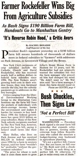
Though the Sun owes much of its retro appearance to the way its designers have decided to lay out the paper, their type choices play a significant role. One look and you’ll see that the paper’s typographical character is defined by its headlines, set in Cheltenham. As one of the most popular (and, for some, the most reviled) American advertising and newspaper types of the early twentieth century, Cheltenham is a thoroughly authentic choice. The original Cheltenham’s gawky shapes and stubby serifs are nicely rendered in the Font Bureau’s Bold Condensed cut used by the Sun. Headlines are only slightly marred by the use of the ill-proportioned ITC rendition of Cheltenham Italic for subheads. (The Sun apparently didn’t care that Cheltenham Italic is also one of the primary headline types of another New York paper they’ve vehemently criticized. The Sunday Times Magazine also uses an excellent custom display Cheltenham that almost repudiates the original in its refinement.) Ideally the Sun would have commissioned a range of tailor-made Cheltenhams to provide for more versatile headlines, but custom typeface development probably wasn’t in their startup budget.
The paper’s secondary headline types come from the great Bureau Grotesque sans serif series. The Bureau Grotesques, which have appeared widely in magazines and advertising over the past decade, are a synthesis and extension of a loosely related group of nineteenth century sans serifs. Drawn by David Berlow, who also did the Cheltenham used in the Sun’s heds, the series expertly summarizes one particular sub-genre of what you might call the ‘late-primitive sans serif’ (Berlow’s Grotesques were later accompanied in this category by Jim Parkinson’s Roswell and more recently by Jonathan Hoefler’s Knockout series). Though the selection of a 1920s or ’30s geometric sans like Metro or one of the Futura clones might have more accurately referenced the era of newspaper typography in question, the Bureau Grotesques do the job just fine. In fact, the dense headlines that the Sun sets with the condensed variations from the series probably couldn’t have been achieved as effectively with another sans. The only exception that could be taken to the way Bureau Grotesque is used in the paper is its absence in cutlines; Helvetica Neue inexplicably appears under photos where one of the Bureau Grotesques would have done just fine.
With the paper’s typographical tone being set for the most part by the typefaces it uses at large sizes, the choice of a text type may rightly have more to do with technical concerns than with aesthetics. This seems to have at least been the reasoning or intuition of Smith in his choosing for body copy Times Europa, a British typeface done in the early 1970s explicitly for newspaper use. Times Europa was commissioned by the eponymous London paper that also instigated the design of the original Times Roman. When the Times decided in 1970 that they needed a text type better suited to their printing environment, veteran type designer Walter Tracy was hired to draw something new. Tracy saw his Times as a hybrid type that incorporated different models while also showing some innovative characteristics. In a Penrose Annual review published after the type debuted, Alan Hutt described Europa as ‘well-rounded, generous in width, with good stroke-contrast and crispness of cut ... it certainly appears of the same order as the great transitionals like Baskerville.’ Though a more stereotypically American newsface might have been more congruous with the rest of the Sun’s design, slavishly selecting something like Century or Corona wouldn’t have made much sense. Times Europa is ‘plain and workmanlike,’ to quote Hutt, and appears to hold up very well under the paper’s printing conditions.

Maybe the most surprising typeface used by the Sun is also the easiest one to overlook. Mantinia, a tremendous set of titling capitals drawn by Matthew Carter, appears in folios, section headings, and as drop caps. It is also used for the words ‘NEW YORK’ in the Sun’s nameplate and in fact, according to Smith, the paper had considered exchanging the nameplate’s traditional blackletter for an all-Mantinia setting. The idea was eventually nixed due to a possible copyright infringement on the Baltimore Sun’s flag, which like the Sun’s flag is comprised of an old engraving flanked by caps on either side. Smith ended up redrawing the Sun’s nameplate by hand to match the flag used by the old New York Sun.
The Sun has certainly taken a lot of criticism since it started publishing and even the design hasn’t escaped the wrath of the paper’s detractors. I’m guessing many saw its retro appearance as being motivated by one of two things: an attempt to lend an unproven paper credibility by adopting a dense, traditional, and text-heavy appearance; or that the old-fashioned look, so clearly referencing the heyday of American newspapers, was just a gimmicky affectation. I didn’t have either of these reactions; instead I think the Sun’s design is just right. For a paper that has billed itself as being primarily concerned with what goes on in New York City, to me nothing could have been more appropriate for the Sun to reflect in its design—whether knowingly or not—the city it serves.