How to Headline a Tornado
The best way to find our way through the news is to understand how it’s made.

If good journalism leads us out of the woods, then bad journalism can strand us in the dark with our questions. Our series on healthy news consumption continues.

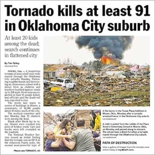
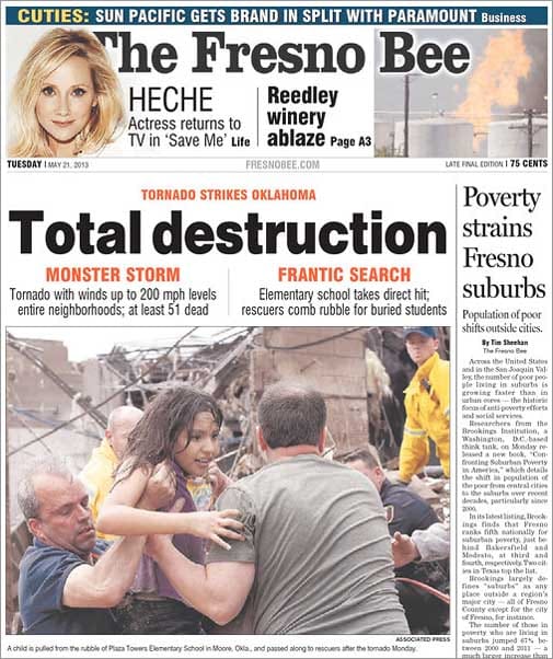
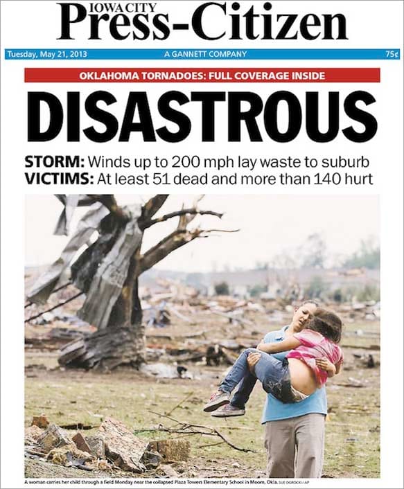
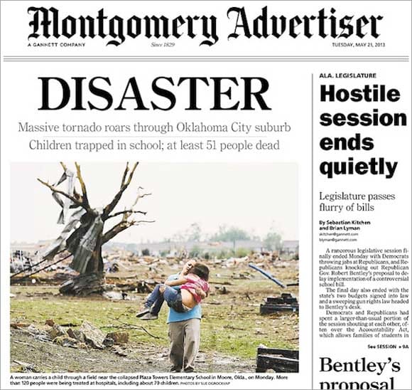
On May 21, hundreds of American newspapers featured front-page coverage of the deadly twister that tore through 17 miles of Oklahoma City suburbs. Many ran the same story—a 1,100-word Associated Press report—under a slew of different headlines.

In California, the front page of the Fresno Bee read “Total Destruction.” The Iowa City Press Citizen opted for “Disastrous,” and the Montgomery Advertiser went with “Disaster.” According to headlines alone, Moore, Oklahoma, was “Hit By a Monster,” “In Ruin,” and “Flattened.” A headline for Pennsylvania’s Times Leader said the tornado killed “at least 51,” while California’s Desert Sun put the number at 91.

Why would the same story generate dozens of different headlines? Newspapers and magazines compete for revenue and stories alike, and headlines bear the brunt. Printed in bold above a story, a single word—a “Disaster,” say, or a “Flattened”—can beckon our attention as well as shape our expectations for the news that follows. Good headlines do both.
Of course, there’s more than one way to headline a tornado. A headline can obscure or uncover; it can be a secret handshake or a shout from a familiar voice. Many of the papers that ran Associated Press coverage emphasized the tornado’s impact (“In Ruin,” “Total Destruction”) or fatality estimates (which reached as high as 91 before settling at 24). The AP story contains within it many of the adjectives used in headlines by other papers—“monstrous” and “flattening,” for instance. The AP’s headline? “Huge Tornado Hits Oklahoma City Suburb, Kills 51.”
While many newspapers used vague headlines to appeal to readers’ curiosity, several Oklahoma newspapers connected to readers by referring to recent history. Rather than intrigue readers with the mysterious, these papers provoked their audience with the familiar. The Oklahoman, based in nearby Oklahoma City, printed “Worse than May 3rd” on its front page, above a photo of bloodied teachers leading children from a Moore elementary school, in reference to a 1999 string of tornadoes that killed 46 people across Oklahoma and Kansas. The Tulsa World’s headline, preceded by the city’s tornado history and estimated casualties, simply read “Moore Again.”
Even a bad headline must be a good lure. For several years, I worked at a weekly newspaper in a city that had two such publications. The rival papers were displayed in brightly colored boxes that often stood side by side. Each had its loyal readers and, I assume, each tried to win over a few from its competitor.
So, every week, our staff considered what combination of headlines and art might boost our readership. We used big photos, bigger fonts, fewer words, innumerable puns. We played to our readers’ expectations, provoked them, and tried to confound them. On more than one occasion, my editor took a galley proof off the printer, left the office, found a distribution box, and replaced the current week’s issue with the next week’s rough draft. From a distance of 15 feet, she’d ask us to decide whether the cover tempted us to pick up the paper.
Online news sites have their own version of this test. In April, Gawker Media owner Nick Denton sent his employees a letter about headline length. He spotlighted a story on Deadspin.com about Notre Dame football star Manti Te’o, whose girlfriend had reportedly died during Te’o’s superlative senior year. The story’s headline, “Manti Te’o’s Dead Girlfriend, the Most Heartbreaking and Inspirational Story of the College Football Season, Is a Hoax”—is 118 characters long.
For many news sites, that length isn’t ideal. Google search results for the Deadspin story returned only the first 70 characters, and omitted important words that came after the limit, like “hoax.” Denton told employees that their “wordy headlines are a growing disadvantage,” and should be kept below 70 characters to take advantage of search algorithms. Gawker published a story about his announcement under the headline “Boss Writes Memo.” It’s a bad headline for the sake of a good joke, but how many readers reached the punchline? At the Nieman Journalism Lab, Justin Ellis skipped the laughs and offered a few alternatives that met Gawker’s character limit the right way—“Denton: Shorter headlines,” for instance.
Headlines shouldn’t just build readership. The best headlines forge a contract with readers that journalists must honor with the stories that follow them. A headline that tricks you into reading a story has done its job once. But a headline that gives you good context for understanding a story, and earnestly following it, has done its job well.
So, if you’re a reader, let headlines pique your curiosity, but be sure journalists deliver further down the page. This advice is an oversimplification, of course. Then again, so is a headline.
